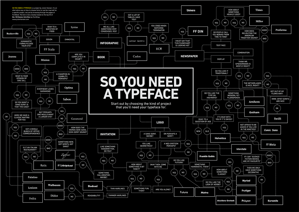
In the not too distant future, if everything goes to plan, I will be graduating with a degree in communication design. How I usually explain this to people is that I'm studying graphic design with special interest in typography and layout. What this means is that people will often contact me with choices regarding the typeface that they should use. Now, first of all, I think this flowchart provides a funny, and not entirely unrealistic look into the process of typeface selection.
But, if you still are unsure, here are five of my favorite typefaces that you can almost never go wrong with. I also attempted to make this a list of fonts that would be accessable to those without a large font library.
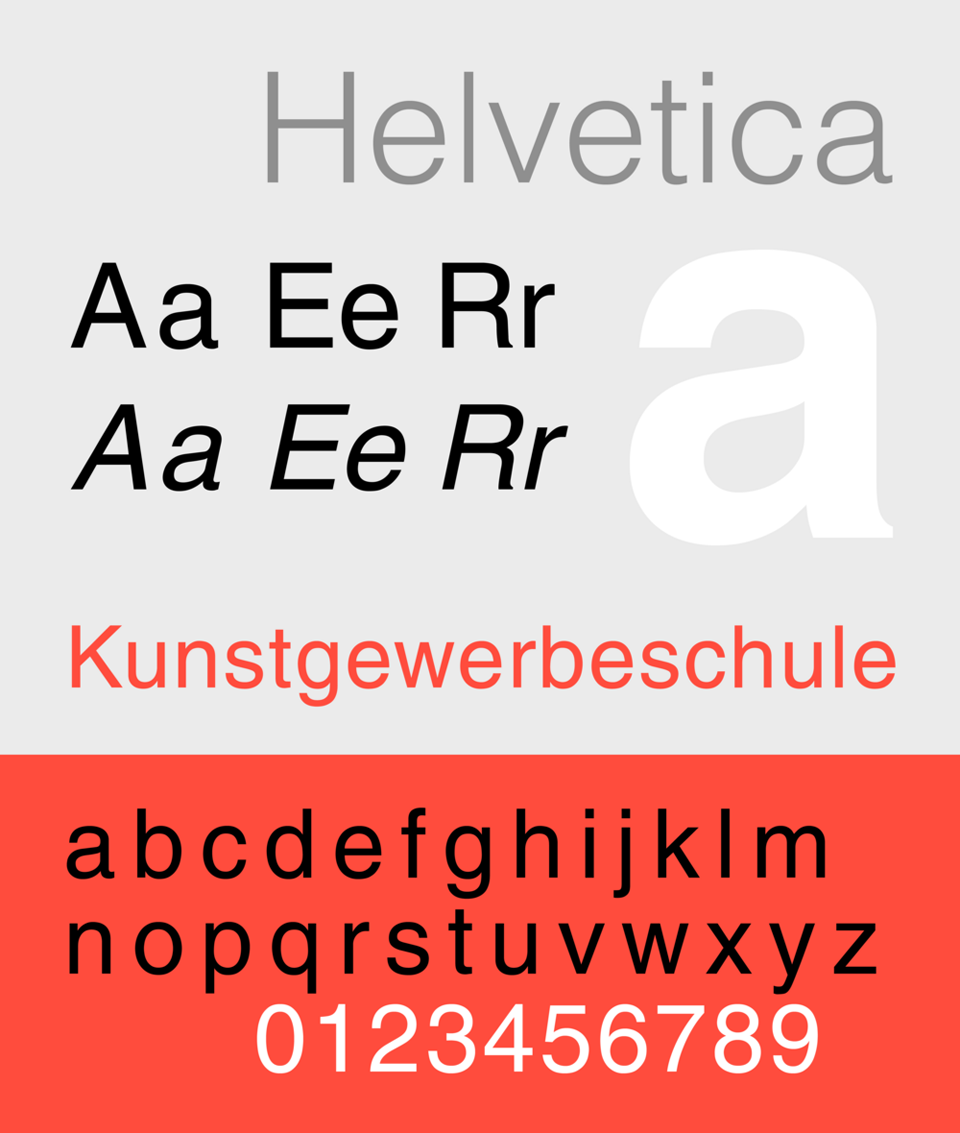
I had to put this one at the top of the list. Its only problem is that it may seem a bit dated, but it rarely seems out and out wrong. Sure, its everywhere, there's a movie about it, its "hipsterish", whatever; it works.

I have long favored the rugged look afforded by slab serif faces such as Rockwell.
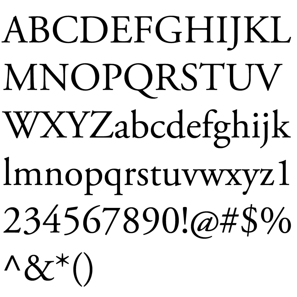
Garamond was always a safe typeface when I first began to work with letters. It has the nice formal edge provided by the serifs, but still lacks the contrast that might otherwise give it too much flair for common use.

Bodoni is the most delicate typeface that I will bring up in this post. It isn't for casual use, but the high contrast of stroke weight gives the face a nice refined feel.
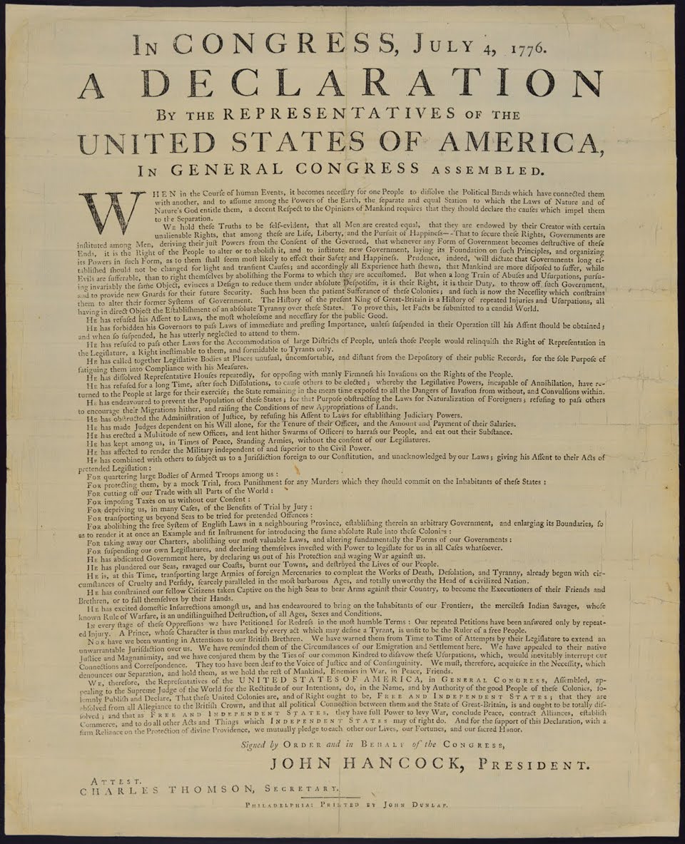
The Declaration of Independence was set in Caslon. Need I say more?

I had to put this one at the top of the list. Its only problem is that it may seem a bit dated, but it rarely seems out and out wrong. Sure, its everywhere, there's a movie about it, its "hipsterish", whatever; it works.

I have long favored the rugged look afforded by slab serif faces such as Rockwell.

Garamond was always a safe typeface when I first began to work with letters. It has the nice formal edge provided by the serifs, but still lacks the contrast that might otherwise give it too much flair for common use.

Bodoni is the most delicate typeface that I will bring up in this post. It isn't for casual use, but the high contrast of stroke weight gives the face a nice refined feel.

The Declaration of Independence was set in Caslon. Need I say more?

coach purses
ReplyDeletemichael kors
hollister clothing store
christian louboutin
michael kors watches
michael kors handbags
christian louboutin outlet
christian louboutin
rayban sunglasses
coach outlet online
coach outlet store online
michael kors handbags
louis vuitton
timberland outlet
uggs outlet
canada goose outlet
burberry bags
mulberry bags
ray ban outlet
kobe bryant shoes 2015
soccer jerseys
concords 11
uggs for kids
adidas running shoes
ugg slippers
coach factory
michael kors uk
lululemon headbands
red bottoms
ugg boots sale
gucci handbags
michael kors handbags
michael kors outlet
burberry scarf
coach outlet store